
Key Takeaways
- Dashboard UX design turns complex data into clear and actionable experiences by prioritising information and helping users understand what to do next.
- Effective dashboard UX is built around decision-making. Users should be able to identify what matters, move from high-level signals to relevant detail, and understand their next action.
- SaaS and enterprise dashboards require UX designed around complex data, multiple user roles, permissions, workflows, and different data states, including loading, empty, error, filtered, and partial-data states.
- The top dashboard UX design agencies for SaaS and enterprises include 9dots Design, Clay, Ramotion, MetaLab, BricxLabs, Eleken, Cieden, Momentum Design Lab, ParallelHQ, and Neuron, in that order.
A dashboard can look polished and still make a product harder to use. At 9dots Design, we’ve seen them all. And yes, by “all” we mean screens packed with charts, filters, numbers, alerts, and colourful graphs, where everything looks important, and somehow nothing does. That problem gets bigger in SaaS and enterprise products, where a dashboard may be the place users spend most of their day. For example, they can use dashboards for tracking performance, managing workflows, or making decisions that have real business consequences.
To put it simply, good dashboard UX is about making complexity feel manageable. Users should be able to tell what needs their attention, understand what the data is saying, and figure out their next move without having to fight the interface.
And that’s where the right UX agency can make a real difference. You need people who can untangle messy information architecture, build sensible interaction patterns, and make sure the final design survives the jump from Figma to a working product.
To help you narrow it down, we’ve shortlisted the 10 best dashboard UX design agencies for SaaS and enterprises. Let’s take a closer look at what each one brings to the table.
How We Selected the 10 Best Dashboard UX Design Agencies
We looked beyond polished UI shots and focused on what actually matters when choosing a dashboard UX partner:
- Relevant dashboard and data-product experience
- UX research and usability testing
- Information architecture
- Data visualisation
- Accessibility
- Design systems
- Case-study depth
- Evidence of measurable outcomes where available
We also considered client reviews and the agency’s experience working with SaaS and enterprise products.
The final list reflects a combination of dashboard-specific expertise, quality of published work, supporting evidence, and relevance to SaaS and enterprise teams.
Also Read: What is SaaS UX Design? Principles, Best Practices & ROI
What is Dashboard UX Design?
Dashboard UX design is the practice of structuring a data interface so a specific user can find, understand, and act on the information they need quickly. It covers:
- Which metrics appear
- How they are grouped and prioritised
- How users move from a high-level summary to the underlying detail
- How the interface responds when data is missing, delayed, stale, or unavailable
A dashboard has to account for far more than the ideal view. After all, loading, empty, filtered, partial-data, error, and permission-related states can all change what a user sees and what they can do. Good UX makes those states clear instead of leaving users wondering whether the problem is with the product, the data, or their own actions.
If you want the fundamentals first, our guide to SaaS dashboard UX design covers the main dashboard types, their components, examples, and the design decisions behind them.
Top 10 Dashboard UX Design Agencies for SaaS and Enterprises: At a Glance
1. 9 Dots Design
9 Dots Design is a global SaaS and enterprise-focused UI/UX agency that works with enterprises and high-growth startups across BFSI, automotive, telecom, consumer, and other complex product environments. Its work spans enterprise and digital product UX, with a particular focus on simplifying complex workflows, data-heavy interfaces, and multi-user experiences. The agency has worked with brands including Royal Enfield, Ashok Leyland, Motilal Oswal, and HDFC Securities, alongside SaaS and enterprise platforms, and offers end-to-end services across UX/UI, design systems, CX strategy, branding, and development.
Services Offered: Enterprise UX, User Research & Usability Testing, UI/UX Design, Design Systems, UX Audit, Frontend Development.
Notable Dashboard and Data Product Work: Airtel, Prescinto, Thermax Edge, POSable, HBK, GreyOrange, Traqcheck, Murphi.ai, Motilal Oswal
Clutch Rating: 4.9 based on 32 reviews
Best For: Enterprises and complex SaaS products in BFSI, fintech, industrial SaaS, automotive, telecom, consumer technology, and other complex, data-intensive domains.
2. Clay
Clay is a UX design agency known for working across digital products, enterprise software, and consumer experiences. The agency combines product strategy, UX, and visual design to transform brands through elevated digital experiences.
Services Offered: User Research & Testing, UI Design, Design Systems, Frontend & Backend Development
Notable Dashboard and Data Product Work: STC Bank, Nuant, Wealth
Clutch Rating: 4.8 based on 32 reviews
Best For: Fintech, banking, and enterprise software products with complex data, workflows, and dashboard experiences.
3. Ramotion
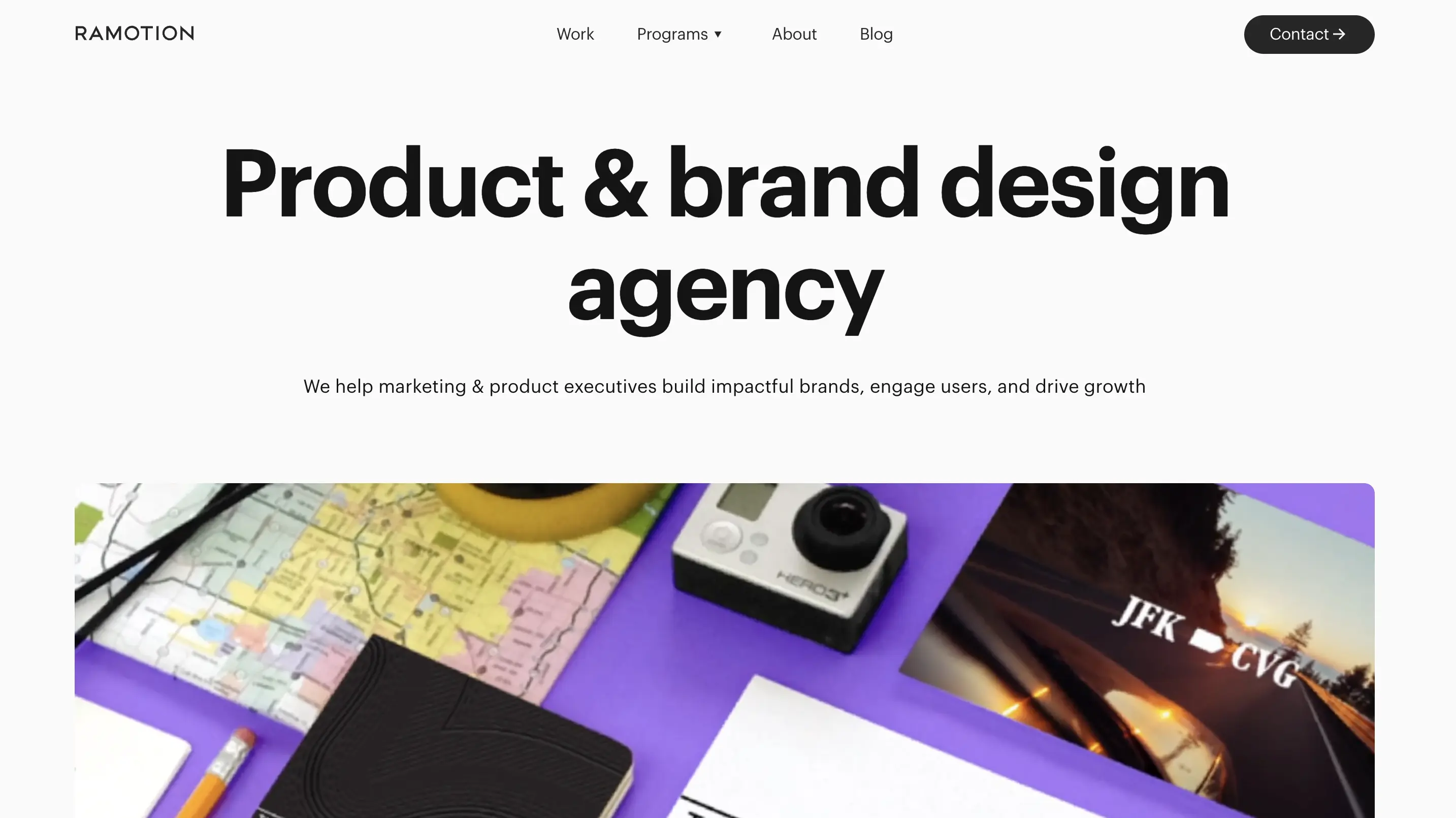
Ramotion is a product and brand design agency with 15+ years of experience, working with startups and established businesses to design digital products and build brands. The agency combines product design and branding with a focus on creating digital experiences and scalable product systems.
Services Offered: Product Strategy & KPI Alignment, UX Audit, User Research and Testing, Product Roadmap Support
Notable Dashboard and Data Product Work: Upstream, EMI Health, Xero
Clutch Rating: 4.9 based on 29 reviews
Best For: B2B SaaS, enterprise software, fintech, security and healthcare products with data-heavy interfaces and scalable product requirements.
4. MetaLab
MetaLab is a global product design and development studio focused on digital product experiences and interfaces. Since 2006, it has worked with brands on products across web, mobile, and custom interfaces, combining product strategy, UX research, product design, and engineering.
Services Offered: UX/UI Design, Design Systems, UX Research & Testing, Product Management, Product Strategy & Vision, Full Stack Engineering
Notable Dashboard and Data Product Work: Nerdwallet, Atlassian, Crypto.com
Clutch Rating: Not yet reviewed
Best For: Enterprise and SaaS platforms with complex web applications, data-rich interfaces, and large-scale product ecosystems.
5. BricxLabs
BricxLabs is a product design and UX agency focused exclusively on B2B and AI SaaS companies, working with teams from seed-stage startups through Series C companies and unicorns. Its approach combines product UX/UI with a strong focus on acquisition, activation, engagement, and retention, positioning design as part of the SaaS growth funnel.
Services Offered: Product Design, UX Audit, UX Design Services, No-Code Development
Notable Dashboard and Data Product Work: Hobbes, Loopback, Writesonic
Clutch Rating: 5.0 based on 22 reviews
Best For: Fast-moving B2B and AI SaaS teams that need product UX/UI to improve activation, conversion, and retention, with a design partner that can iterate at startup pace.
6. Eleken
Eleken is a product design agency that works exclusively on SaaS products, particularly complex B2B applications, dashboards, data tools, and AI features. Its approach combines product UX/UI with user research, information architecture, and design handoff, with designers working directly with SaaS product teams.
Services Offered: Design as a Service, SaaS Design, UI/UX Design, UX Audit, Design System, Consulting
Notable Dashboard and Data Product Work: WireFilter, Floret, Hubble Network
Clutch Rating: 4.9 based on 127 reviews
Best For: SaaS teams that want ongoing design capacity on a predictable monthly cost (subscription model) rather than a scoped project, and that want to test the working relationship before committing.
7. Cieden
Cieden is a UX/UI design agency focused on B2B and AI applications, with a particular emphasis on simplifying complex workflows and advanced functionality. It has completed 200+ projects focused on complex B2B products and positions itself around data-driven UX and AI-driven product innovation.
Services Offered: Product Design, UI/UX Design, UX Consulting, Web App Development
Notable Dashboard and Data Product Work: Cogs’z, Open IQ, Carbon Lighthouse
Clutch Rating: 4.9 based on 46 reviews
Best For: B2B and AI products where complex business workflows, dashboards, and data visualisation need to be made easier to understand and act on.
8. Momentum Design Lab
Momentum Design Lab (now HTEC Momentum) is a product and design agency that combines product strategy, UX and product design, technology, data and AI to define and build digital products. Its approach brings strategy, design and engineering together across the product lifecycle, with a strong focus on human-centred and data-informed experiences.
Services Offered: Product Design, UX Assessment & Optimisation, AI Strategy, Experience Design
Notable Dashboard and Data Product Work: Coalfire, Sifted, Technomic
Clutch Rating: 4.8 based on 96 reviews
Best For: Data-intensive enterprise platforms and B2B products where product strategy, UX, data visualisation and engineering need to work together – from complex dashboards to AI-powered decision-support experiences.
9. ParallelHQ
ParallelHQ is a product design studio that helps teams build better products through product discovery, data-driven UX and end-to-end product design. It works closely with product organisations with a strong focus on AI-native products and B2B SaaS while adhering to the philosophy of “outcomes over deliverables.”
Services Offered: UX Design, Design Systems, User Testing, AI Experience, Vision Prototype
Notable Dashboard and Data Product Work: Juspay, Sequifi, Inhouse AI
Clutch Rating: 4.8 based on 9 reviews
Best For: Early-stage AI and B2B SaaS products where dashboards, complex workflows, and onboarding need to drive faster adoption.
10. Neuron
Neuron is a UX/UI design agency focused on enterprise software and B2B products. It combines strategy, research, and human-centred design to simplify complex workplace tools.
Services Offered: Product Strategy, UX/UI Audit, UX/UI Design, Dev Delivery and Hand-off, Team Augmentation
Notable Dashboard and Data Product Work: Listrak, Vendr, Revive
Clutch Rating: 5.0 based on 52 reviews
Best For: Data-heavy enterprise products, from analytics dashboards and BI tools to CRM/ERP and cybersecurity platforms, where complex workflows need to work for multiple user roles.
How Long Does a Dashboard Design Project Take?
A dashboard UX design project can take anywhere from a few days for a focused UX audit to several months for a multi-role dashboard suite or full product redesign. The timeline depends mainly on:
- The number of screens and user roles
- Data complexity
- Research requirements
- Design-system needs
- Stakeholder involvement
- Whether development is part of the engagement
Now, these are planning ranges, and not fixed industry benchmarks. For instance, a relatively simple dashboard with an established data model can move quickly, while a dashboard involving multiple user roles, complex permissions, new data structures, extensive research, or frontend implementation can take considerably longer.
If you want a more accurate estimate, it’s recommended that you first assess the number of user roles, dashboard views, data sources, interaction complexity, research scope, and required deliverables rather than estimating from screen count alone.
Also Read: UI/UX Design Cost for SaaS in 2026 (Pricing Guide)
What Good Dashboard UX Looks Like: Case Snapshots
Let’s understand what good dashboard UX looks like by holding up against real product complexity. At 9 Dots Design, that has meant designing dashboards and data-heavy experiences for multi-role enterprise platforms, B2B SaaS products, and operational systems.
Airtel
Airtel’s cloud communication platform had to bring voice, SMS, and digital customer interactions into one enterprise experience. At the same time, it also had to serve both business administrators and frontline support agents. We mapped the service end-to-end, then designed separate but connected experiences around the needs of each role.
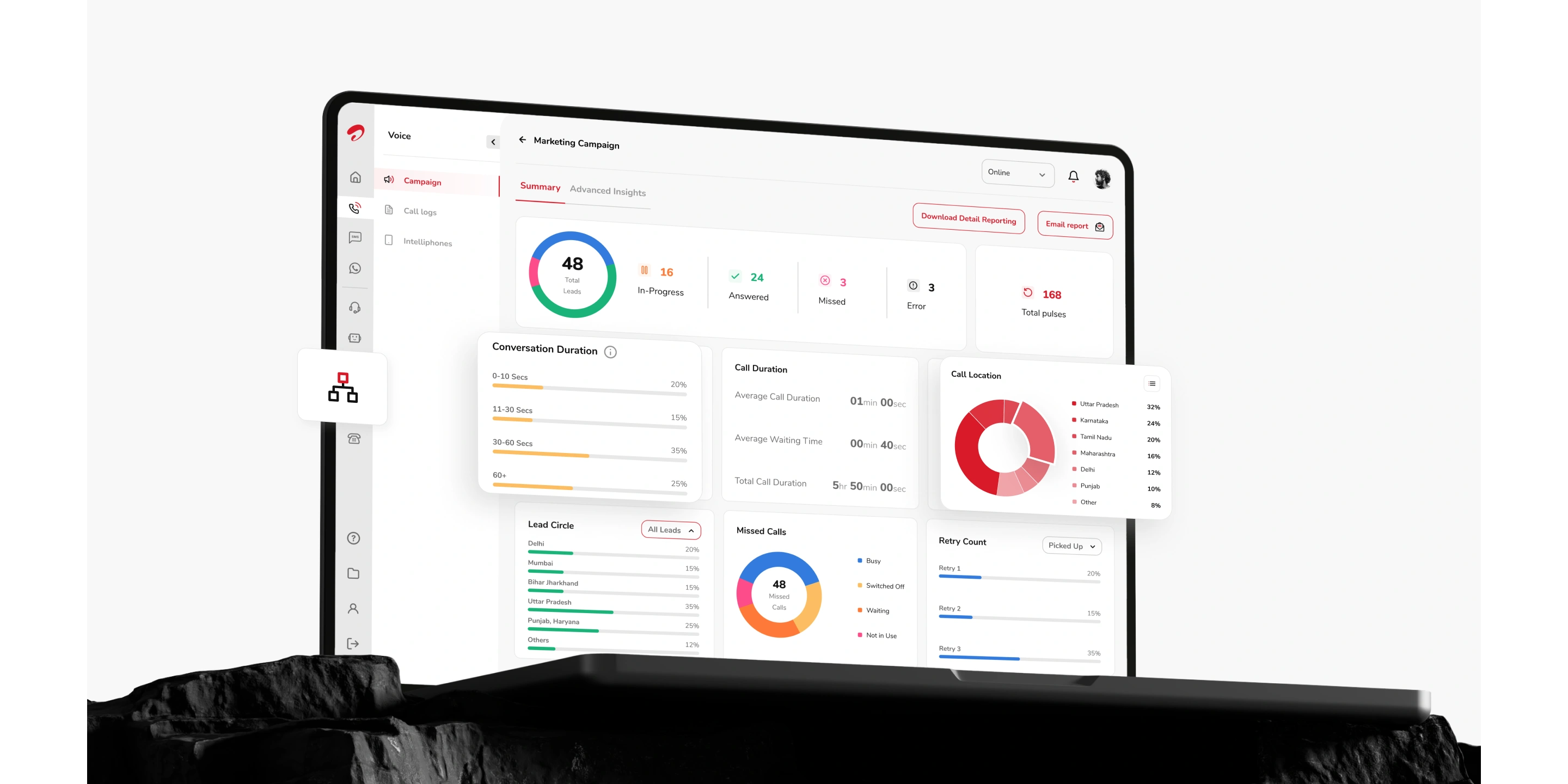
The resulting system brought operational visibility, call intelligence, and number management into a more unified experience, while keeping agent workflows focused and distraction-free. The redesign contributed to a 25% increase in agent efficiency and 30% faster customer response speed.
POSable
POSable is a B2B SaaS retail analytics platform built around six different user segments, each with different levels of analytical needs. We reworked the information architecture around these users and created a scalable design system to make complex retail data easier to navigate and understand.
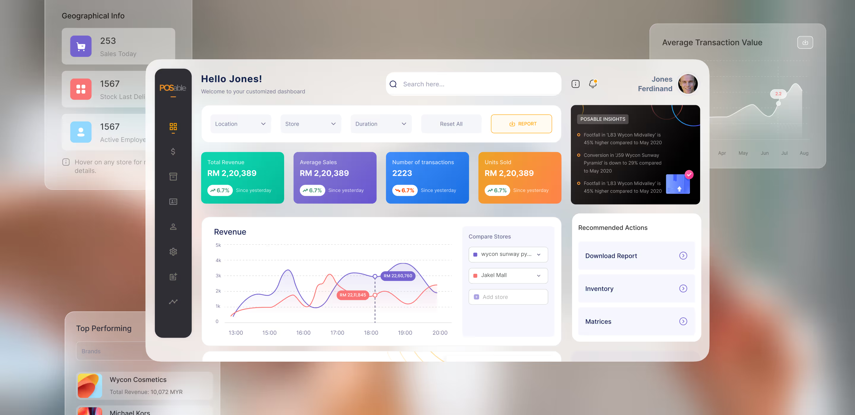
Rather than giving every user the same dashboard experience, the product helps each audience get to the information that matters to them while keeping the underlying system unified.
Prescinto
Prescinto brings together performance data from solar plants, where operators need to monitor energy yield, availability, alerts, and other operational metrics without getting buried in the detail. We shaped the experience around these decision-making needs, using clearer data hierarchy, dashboard wireframes, alert management, and multi-site views.
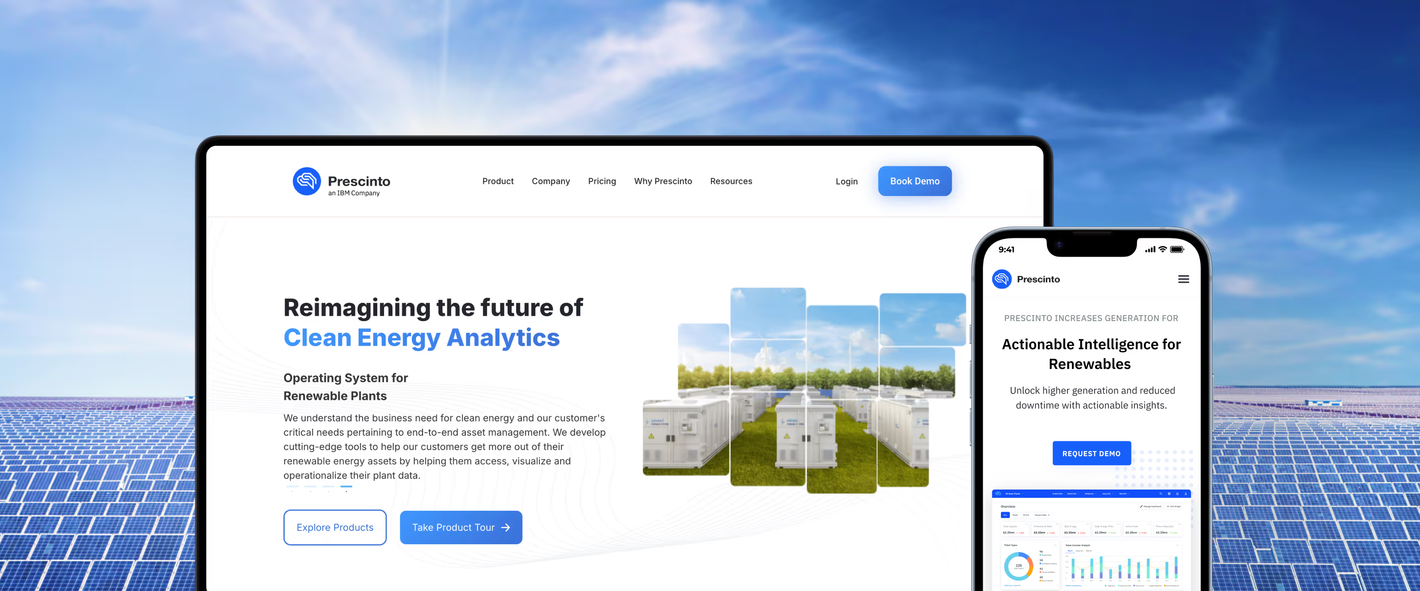
The result turns real-time plant data into a more actionable operational experience, contributing to a 30% reduction in fault response time and a 25% improvement in plant performance monitoring efficiency.
HBK
HBK’s multi-industry data acquisition platform had to make complex configuration and monitoring workflows easier to manage across diverse hardware. We used stakeholder input, user research, usability testing, and user-acceptance testing to shape the system architecture around real acquisition processes.
The resulting experience brings device management, data visualisation and automation together in a modular framework, giving the platform room to accommodate new analytics and capabilities as it evolves.
Make Complex Data Easier to Act On
Choosing a dashboard UX agency ultimately comes down to more than a strong portfolio, you see. The right partner should understand your users, your data, your workflows, and the decisions the product needs to support. Further, it should also know how to turn all of that complexity into an interface people can actually use.
The agencies on this list bring different strengths to the table, from B2B SaaS and AI products to enterprise platforms, financial systems, and data-intensive operational tools. The best choice depends on the complexity of your product, the users you serve, and how involved you need your design partner to be.
At 9dots Design, we work at that intersection of product complexity and usability, helping enterprises and SaaS teams design clearer and more scalable digital experiences across BFSI, fintech, industrial SaaS, automotive, telecom, and other data-intensive domains. Our work spans user research, enterprise UX, dashboard and data-product design, design systems, UX audits, and frontend development.
And if you think that expertise could help bring your product vision to life, we’d be happy to hear what you’re building. Get in touch with our team to start a conversation.

Related Posts

What Is HMI Design in Automotive? Principles & Patterns
Many years ago, I worked for my parents who own a video production company.…